

There are hundreds of thousands of fonts out there. The choice is huge and overwhelming. Certain typefaces will work perfectly in some situations, but that same font can feel wildly inappropriate in others. And what about legalities when using fonts? Someone put time and skill into creating them, so can we use what we want where we want? What about accessibility considerations? Some fonts are easier to read than others.
This is the first of 2 blogs about typography where I will guide you through some dos and don’ts, give resources on where to get fonts from, practical considerations when choosing fonts for your brand or logo. I’ll even give the perfect example of how using a font in the wrong context can harm your brand and prove that when it comes to fonts – looks do matter.
To find out what’s coming next month, scroll to the bottom…
A few things to know before you start shortlisting your choices…
Terminology
Weight and style
Font weight is the thickness of the letters within a font. Light, regular, bold, black and more.
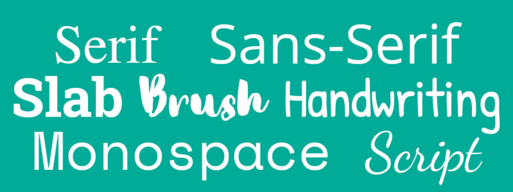
Font style – there are a few traditional groups – serif, sans-serif, slab-serif, script, handwritten and more modern styles that include decorative, stencil, calligraphy, brush and more.
Serif fonts have little tails on letters (think Times New Roman, Garamond or Baskerville). Sans-serif fonts are more simplified – they have no tails on the letters (think Open Sans, Roboto and Lato).
The difference between Font and Typeface (and does it matter?)
Language changes and evolves. Typeface and font are now commonly interchanged and many use them to mean the same thing but there are technical differences in the meaning.
The main difference is that fonts create a typeface – or fonts are the individual, a typeface is the collective. For example, Helvetica is a typeface and it’s made up of lots of different fonts that each have different weights, sizes and styles (light, regular, bold, black, italic etc).
Does it matter if you know the difference? Not really. But these things are good to know.
Licences
Nothing is ever free. And I really do mean that. Including fonts.
Rob wrote a blog about copyright recently (it’s here), and in exactly the same way as music, images and words – fonts are designed by a creative and you need to ensure you have the correct licences in place before you use them. Fonts that are pre-installed onto your computers are fine to use, but not in every circumstance. You can’t always use a font that is on your laptop for your website or in a logo. Always check.
Beware of ‘free’ fonts
This is a very common mistake, but be aware – just because a font is free to download, it does not mean that it is free. Many are free to use for personal use, but not commercial. ALWAYS check the licence. There are vast amounts of websites that distribute pirated fonts too – don’t be fooled. Unless you have a licence that specifically states commercial use, don’t use it.
Personal use, commercial use and open source
Many fonts are free to use for personal use, but not for commercial. What does that mean? And remember this applies to both physically printed and digital fonts.
Personal use is anything you are not making a profit from. Things like you making a birthday invite or a school project.
Commercial use is whenever a font is used in context of making a profit. Examples include logos, websites, packaging, posters, social media posts, business cards, books, apps.
Open Source fonts are licenced so anyone can use them for any purpose, free of charge. You can find that licence here. There are lots of them, and they’re especially great for website projects.
Website licences
Many website builders come with a ready-to-use selection of fonts. WordPress, WIX and Squarespace all have Google fonts embedded, which you can use free of charge. However, if you’re looking to use a specific non-standard font, you’ll need to ensure you have a website usage licence in place. And (just to make things a little more complicated) sometimes these licences are issued based on usage which means how many visitors to your website you get.
Where to source your fonts?
Google Fonts
Google fonts are all open source. This is a fantastic resource – especially for websites. As mentioned above, many website builders come with them pre-installed. You’ll find them in apps like Canva too.
Creative Market
A huge collection of typefaces – most with low licence costs. Not all have website compatible fonts, but many do.
Adobe Fonts
If you have a Creative Cloud subscription, Adobe font licences are included. Be aware, that you if you cancel your subscription, you will then need to purchase a licence to continue using that font
Things to check when choosing a font
With so many options available, it is easy to get overwhelmed by choice so here are a few tips to help you narrow down that initial selection.
Language
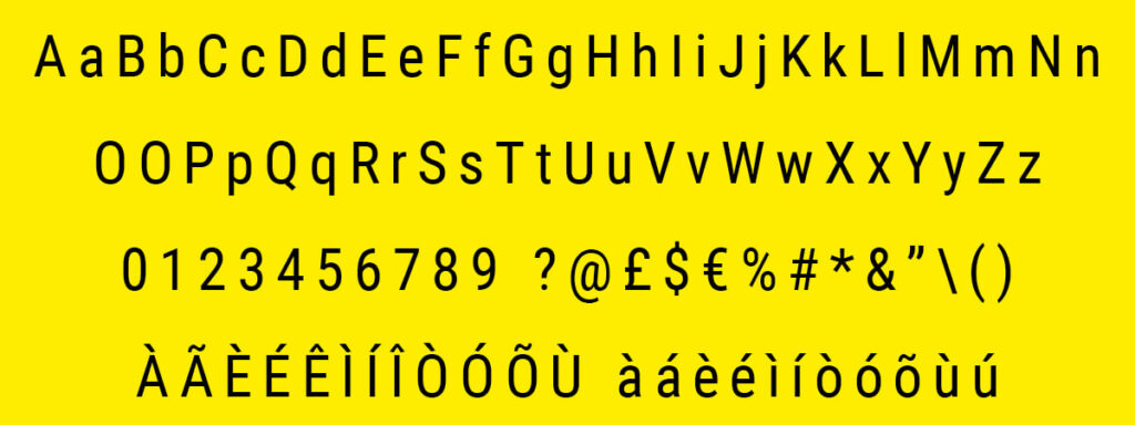
Not every font is designed to be used in every language, so keep your clients in mind when choosing. Simple things to check are currency markers – does the font have a pound, dollar or Euro symbols for example? I’ve worked with a few dual-language clients, and for them, it was essential that all fonts had accents so they could write in both English and another language (French and German for example). Not all fonts include accented characters or all currency symbols, so check they are included if you need them. This is especially important for non-Latin based languages.
Font variants
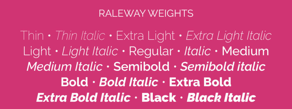
Not all typefaces come with font variants. Not so important for your logo, but for design and website use, it is. It’s worth checking that any font you want to use for your body copy comes with at least regular, italic, bold and bold italic weights. The more weight options the typecase has more flexibility you have in your designs.
Legibility
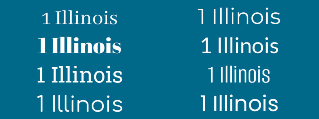
It’s fairly obvious to say that whatever font you use, people need to be able to read it clearly. But even some of the most well-used fonts have letters that are remarkably similar. These similarities can cause confusion so need to be considered. Accessibility is important after all. Sometimes these confusions will be caused by a specific combination of letters.
For example – capital letters I and L look almost identical to the number 1 in certain typefaces (I’m looking at you Gill Sans).
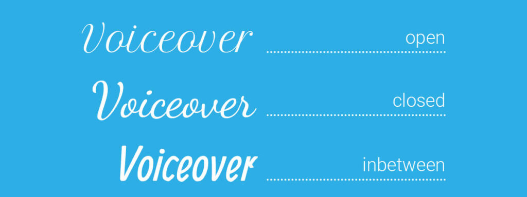
Some script or handwritten fonts have a closed ‘r’ which, when used at the end of a word like voiceover can be tricky to read.
Skinny and fat fonts can also help or encumber reading. Thin or condensed fonts can be harder to read on screens. Wide, open fonts, whilst easier to read on screen, do take up more physical space. Worth considering if you have an especially short or long name you want to use in your logo.
Emotives
When you’re choosing a font to represent you – your brand and business – it’s important to consider the emotional response to that font. How does a font make you – and more importantly, your clients – feel? Is it tall, elegant and graceful? How about sturdy, reliable and solid? Playful or friendly? Traditional or modern? They are all important factors to consider.
Emotional response matters.
Rob once had a contract of employment given to him that was entirely set using Comic Sans – I kid you not. A legal, professional document put together using a font that represents children and play and cartoons. It gave the impression that the employers didn’t take that document seriously. It made them look silly, careless and like they didn’t know what they were doing. A simple change to another font would have made the document (and that business) look professional, serious and official.
When it comes to fonts – LOOKS DO MATTER!
In next month’s blog, I’ll be looking at how to pick fonts for your brand including how many fonts you need for your brand and website, how to test what they look like BEFORE you buy licences. And I’ll give some great font combination examples too. Subscribe to our newsletter to be the first to know when that goes live.
For anyone interested in reading more about fonts – I highly recommend ‘Why Fonts Matter’ by Sarah Hyndman (which you can buy from here).