Fonts are so much more than just a bunch of letters. They convey words and help communicate, yes, but they also evoke emotional responses, show personality and can impact our businesses in a positive or negative way. It’s important to carefully choose which fonts will represent us. And I’m here to help you.
I’ve always been a bit of a type geek. When I was 16 I did work experience in a print room and fell in love with type and print. In the late 90s, when I was studying for my graphic design degree, I entered my work – a proposal for a typography web-zine – into the International Society of Typographic Designers awards. I was successful and was granted membership to the society. I’m very proud of my young graduate designer self. Rob thinks it’s hilarious that I could have used ‘BA STD’ after my name (he’s right – I didn’t use it!).
This blog will make a whole lot more sense if you read How to choose great fonts for your brand part 1 first, so off you pop to that one, then come back here and enjoy more talk about type!
Look and feel
Looks do matter with type. Part one of choosing your brand fonts covered some basics about type styles, licences, where to source fonts and legibility. This blog looks more closely at why it’s important to pick fonts that best represent you and your voiceover brand values. And how we respond to different typefaces.
Character characteristics
How do letters sit next to each other? This might sounds like a really picky thing to think about when you’re choosing fonts for your voice over logo, but the way letters sit next to each other is as important as how the overall typecase looks.
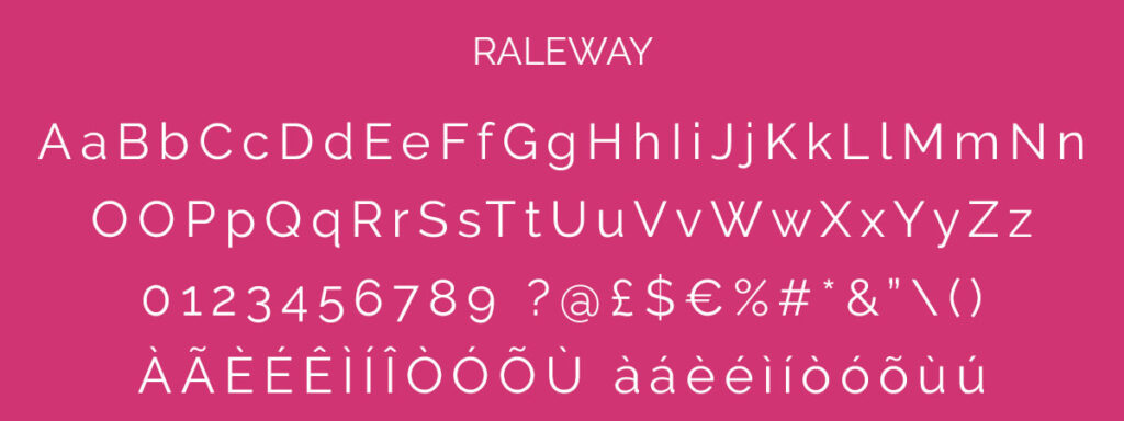
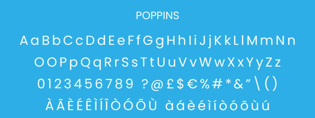
So what are we looking for? Take these two examples below – one is Raleway, one is Poppins. Initially these fonts look similar – they are both sans serif, both have wide letters, both have Latin accented letters. They also have multiple weights (bold, light, italic etc). So why choose one over the other?


Look at the lowercase ‘a’. Poppins has is a rounded shape or ‘single-story’ a. Raleway has a ‘double-storey’ or ‘bell-hooked’ a.
Look at the w letters – Raleway has a crossed, more ornate letter w (both capital and lowercase) whereas Poppins has a simple w shape.
Look at the numbers for each font. In Raleway, the numbers 3, 4, 5, 7 and 9 site slightly lower than the other numbers. With Poppins, all the numbers align top and bottom. This is a small difference, but some people simply don’t like the look of numbers that are not aligned.
When you’re picking a font get picky! What can at first glance be a similar font, can in fact have a lot of subtle differences. None of these differences are right or wrong – it’s all about personal preferences.
Script fonts often have letters that sit above or below other letters, often having extra-large capital letters too. This can look fantastic in a logo, but can cause legibility issues on a website.
Emotive response
I briefly talked about our emotive response to fonts in part one of choosing fonts for your brand. This part of picking your branding font can’t be underestimated. Look at the below samples. All the same words and numbers, but the font used on each will provoke a different response from you and everyone else who looks at them.

How do you feel about each of the options above? Which do you like, which don’t you like? Do you think they would be a good or bad representation of your brand values? How does each one make you feel? Are they formal or informal? Classic or modern? Dramatic or understated? And would these feelings represent your voiceover brand values?
When I’m working with clients on branding or website projects, we spend time working out what they DON’T like as well as the things they DO like. It’s important to know both and why they do or don’t like certain things. Again, there are no right or wrong answers – it’s personal preference – but remember to keep your own ideal client in mind when choosing. If they are a high-end, suit-wearing business they are unlikely to respond well to a logo using Comic Sans or Papyrus. Far better to use more traditional serifs (like Baskerville or Playfair Display), or a clean, simple sans serif typeface (like Open Sans or Montserrat).
How many fonts should my voice brand have?
Generally your brand should have two or three fonts.
- Main font – used in your logo and usually used for headlines and subtitles on your websiste too.
- Supporting font – possibly used in your logo alongside your main font, but mostly used for body copy on your website.
- Accent font – used as a way to highlight certain words or sentences on your website and also used on social media posts.
These are the fonts we use…

- Main font = Raleway. This is used in our logo and for all the headings and subtitles on our website.
- Supporting font = Roboto. All body copy is in Roboto.
- Accent font = FF Market Pro. Used for buttons and accent copy.

I also break my own rules of only using 2 to 3 fonts and use a fourth font, Ocean Secret. “How very wrong” I hear you say, and yes, but also no. Learn the rules then learn how and when to break those rules! And – and this is the important bit – this font is only ever used when I’m creating graphics for social media.
Checklist for choosing fonts for your brand
Here’s a checklist for you to use when you’re choosing great fonts for your voiceover logo and brand.
Step 1 – pick your main font
This will be the font for your headlines, logo and used when you’re creating social media graphics.
Step 2 – pick your supporting font
This will mainly be used for body copy on your website, so check it has all the characters, accents and symbols you need for your business. This font should complement your main font. If your main font is highly stylised, go for something more simple and clean.
Step 3 – pick your accent font
Not everyone will need this step. If you’re a fan of creating graphics for use on social or you want a handwriting font for more informal copy on your website, a third font can really complement the other two.
Step 4 – make sure your fonts complement each other
Test how the fonts look together – make sure they don’t jar or clash. FontJoy is a fantastic free tool that allows you to live test fonts on a website so you can see how things will look. I’ll also be looking at more font pairing inspiration in next month’s blog with a few useful tools too, so check back for part 3.
Step 5 – decide how you will style your fonts
What I mean by this is decide how to use bold, capitals, italics, underlines etc. Are your titles always going to be in all capitals or will they be bold or not? And what colour will they be? Will URL links be underlined, bold or both, or maybe a different colour? Will you write testimonials in normal or italic text? Deciding all these things will help keep your brand look consistent. Using consistent colours with your fonts also helps your brand and gives a visual guide through your website too. For example, our main headings are always Raleway in our turquoise colour.
Want to know more about fonts?
For anyone wanting to look more in-depth at fonts, typography and how we (and others) react to them, I highly recommend Why Fonts Matter by Sarah Hyndman (check our her website Type Tasting too). It’s a wonderfully visual book packed with examples, practical advice and quizzes.
Want to explore your own brand fonts?
If you’d like to look at your own voice over brand and website fonts then take a look at my brand, logo and website services.

