Client: Alix Perry Voice Artist
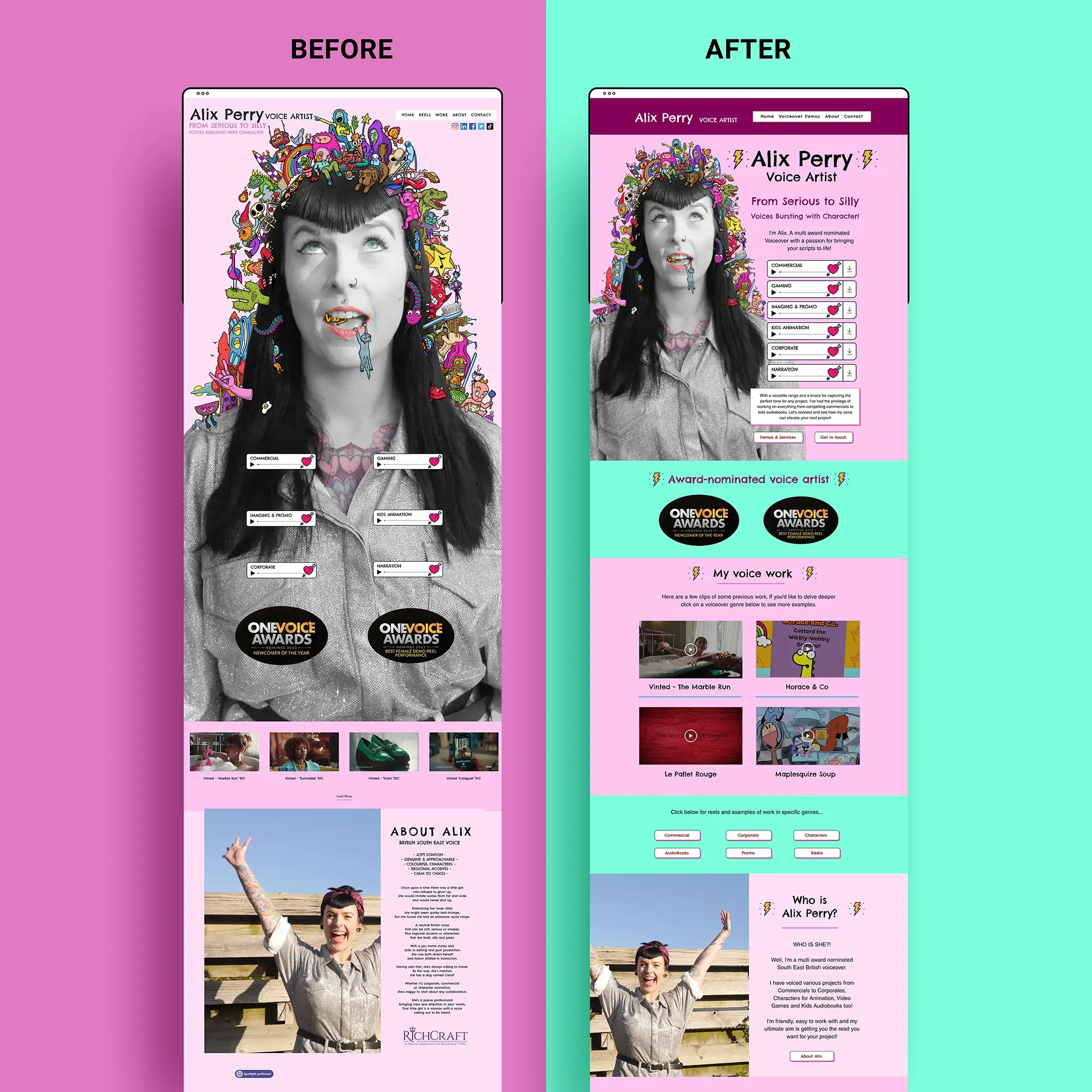
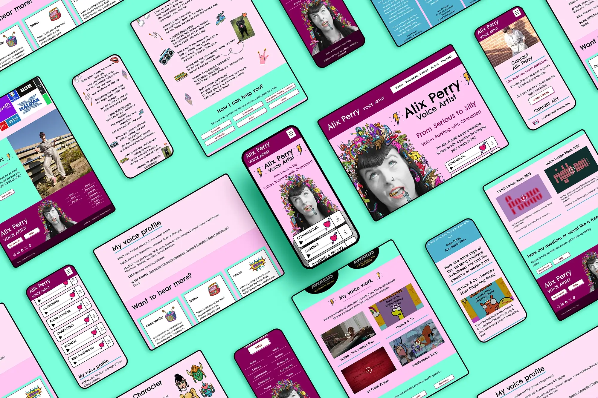
Voice Artist Alix Perry’s existing WIX website, while beloved, required some significant structural updates, better organisation, and optimisation for both her clients and search engines.
All of the content was on a single long page, making navigation cumbersome for visitors. She wanted to break the content into multiple pages but was unsure how to maintain consistency in style, colour schemes, and design.
Alix felt anxious about making these changes on her own. Every attempt to rearrange elements on the site resulted in them accidentally “messing everything up.” Their lack of technical know-how in web design had led to a cluttered layout, with important links randomly placed.
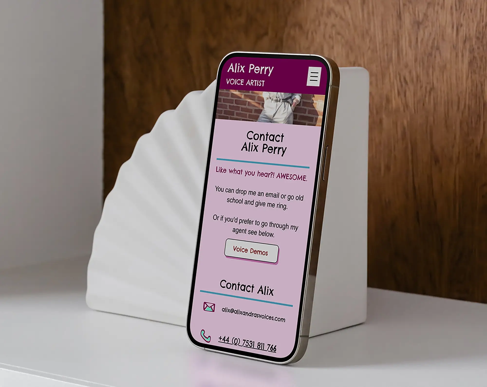
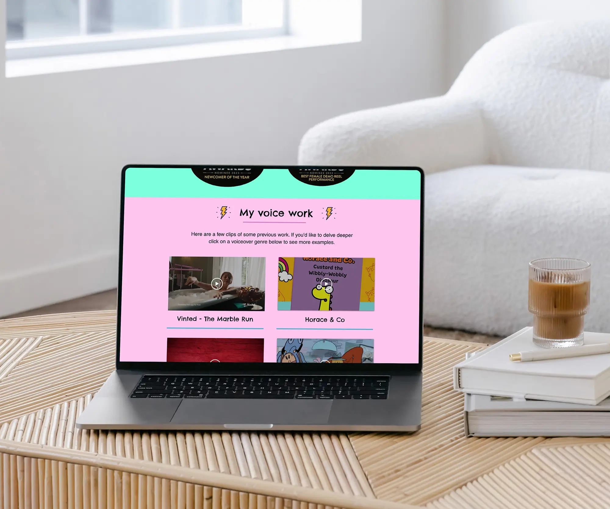
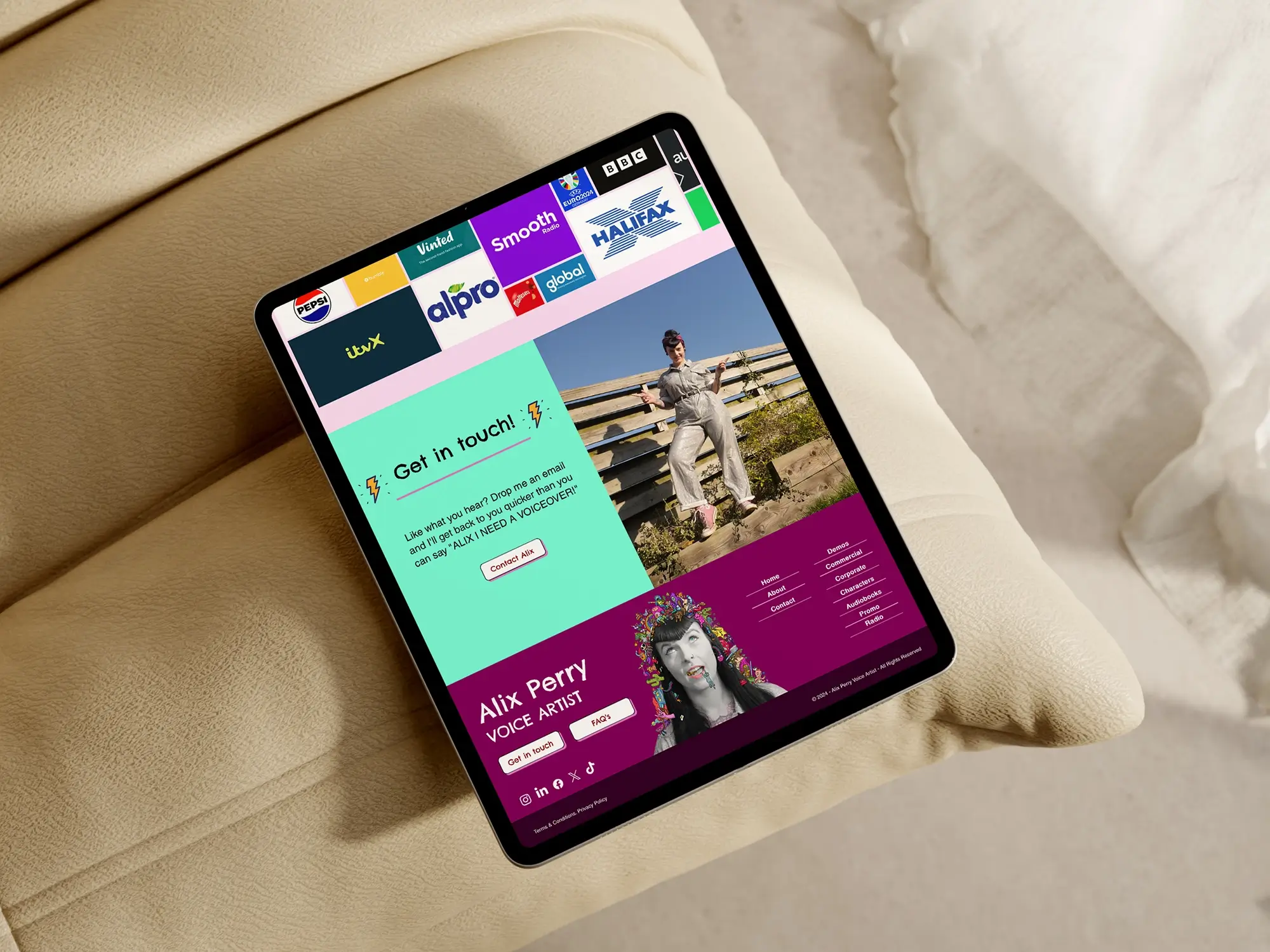
By the end of the project, Alix had a newly optimised and beautifully structured website that showcases their work effectively. The site was fully SEO-optimised, organised into multiple pages, with downloadable demos and provided an excellent user experience across devices.




Subscribe to our newsletter below...
Wonderful voiceover goodness is on its way to your inbox!
Thank you! 🙏🏻