It’s always a good feeling when one of your clients gives positive feedback on a project. It’s an even more wonderful feeling when they write about their experience completely un-prompted on their blog. My smile grew even bigger when I was given the OK to re-produce that blog for you to read here.
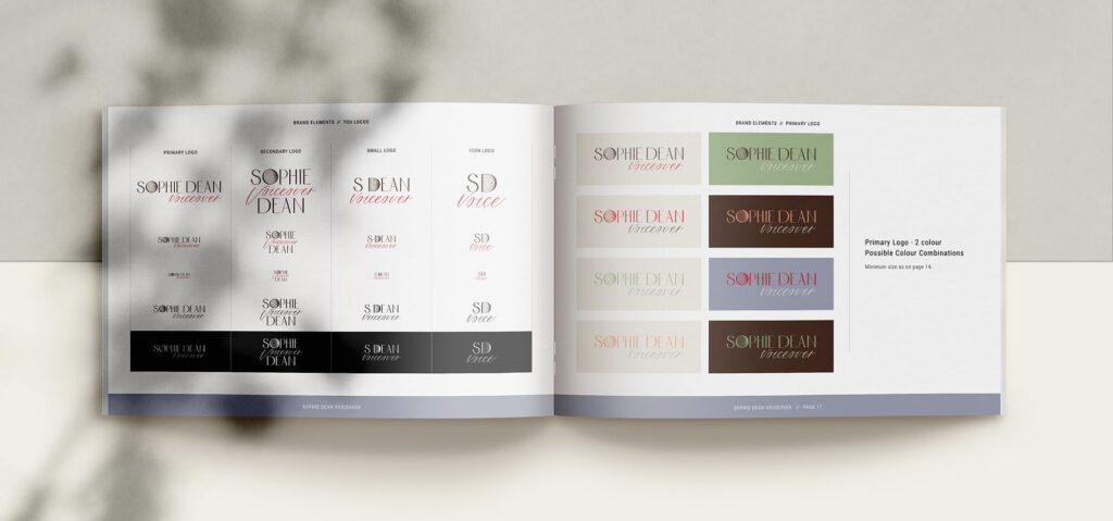
I worked with Sophie to create her new branding, logo, website and social media templates. You can see the full project here and read Sophie’s original blog post here. I’ve added some images of Sophie’s brand guidelines to help illustrate the things she talks about.
A huge thank you to Sophie for writing this blog and letting me re-post it here.
My new website, which has been designed and built by the wonderful Helen Bee at B Double E is live, and I am ridiculously happy with it.
I initially looked for a website designer on a voiceover Facebook group and Helen was recommended by so many people, I couldn’t not have a zoom call with her. After the call, I figured it was worth spending more money than I had originally planned to, as you really do get what you pay for with these things.
Discovering my brand
The first aspect of the website design was to discover my ‘brand’, which up until then was non-existent. Through questionnaires and conversations, Helen established my brand identity, which is: friendly, approachable, creative and adaptable.
“Creative and providing elegant solutions to client’s problems. Everyday functionality, honesty, dependable, not pretentious, a straight shooter, people orientated.”

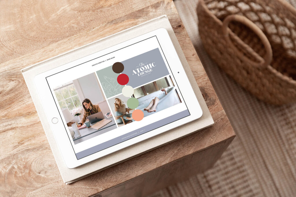
From here, colours and typography that reflected the brand could be explored. I was presented with mood boards of different ideas and styles of photography. Eventually choosing one with simple photography, that included plainer backgrounds and props, text in fun but solid styles and the brand colours you see on the website now. My tagline ‘Bringing life to your words’ also emerged and Helen thought of a clever way to make the final word of the tagline rotate to say different things, appealing to more potential clients. Did you spot it on the homepage? [NB: you can see the homepage here.]

Logo
The next stage of the website design was the logo. This was by far the hardest part of the process for me to make decisions on and I went back and forth about typography and style. Helen initially showed me her ideas in black and white, so I wasn’t swayed by colour. My final design is simple yet artistic, with the art deco font on my name. The handwritten font of the word ‘voiceover’ adds a personal touch and the sound waves in the ‘O’ give a subtle nod to voiceover. But hopefully, you worked all that out before I told you.

Photography
Having professional brand photos taken was something I ummed and ahhed about getting done, however now seeing how great they look on the website, it was so worth the money spent.
Nevra Topcu from Folie à Deux Productions was my wonderful photographer who was recommended by my LinkedIn connections. Before the shoot we had a ‘discovery call’, where we talked about my new branding and she took the time to understand my business. After the call, Nevra set up a Pinterest board with ideas.

We spent the photoshoot day both out in London and in Nevra’s studio and got a selection of work, hobby and playful shots. You can see a collection of some fun ones on my About page. We got lots of the brand colours in the photos, they perfectly reflect the friendly and approachable vibe we were going for and bring the site to life.
SEO
Helen is not only a great website designer but knows a lot about search engine optimisation too. She optimised my images and added alt text for visually impaired people and those using screen readers.
In the SEO Episode of the Voiceover Social, Helen shares lots of nuggets of wisdom, such as encouraging people to have a multi-page website rather than a single page. Google can read several pages much more easily than one long page with all the information on it. Also, she advised using subheadings on your pages and short intros to tell google what people are about to read/listen to.
Finishing touches
Once the website was built, Helen created a google docs spreadsheet to make noting down any amends easy. I am quite picky with tiny details, but nothing was too much trouble for Helen. When the site went live, Helen did live training over Zoom to show me how everything worked and how to add new content, this was invaluable, and I refer to the recording often.
One of my favourite things about working with Helen was the beautifully curated pdfs she sent me for every step of the process, exploring brand colours, logos, typography etc. This meant that I could see all the options and really understand the thoughts behind each one. There was also a ‘calendar’ at the end of every document that showed me where we were up to on the timeline towards the finished product.

Conclusion
If you are not sure about getting your website designed and built for you, it’s worth having a chat to some website designers who can answer your questions.
For me, by doing it myself, my website was never going to look as good as I wanted it to. I found Squarespace frustrating to use and costly. Now my site is on WordPress and uses Elementor, the WordPress website builder, which couldn’t be simpler and is very intuitive. The time and stress I save by having a great-looking, accessible website, that has the client in mind, is worth every penny.
Hopefully, my new brand and website instil confidence that I could bring your brand to life. Don’t hesitate to contact me if you have any questions or want a sample demo.
To find out more about Helen’s branding packages click here.
To find out about Helen’s website packages click here.


