

Picking out your brand colour palette for your voiceover business can be tricky – after all there are millions of colours out there. And with so much choice, it’s easy to get overwhelmed. This is aimed to help, give you some ideas on where to begin and give guidance on how to make sure your colours work well together. With each branding and website project I do, it’s part of the process I really love working on – I really do have a thing with colour!
How do you start to pick your own voiceover brand colour palette?
Before you dive into picking specific colours, you need to create a mood board that reflects your brand personality – I talked about that here.
Once you have a mood board that feels right for your brand, you can then start picking out colours from within that board.
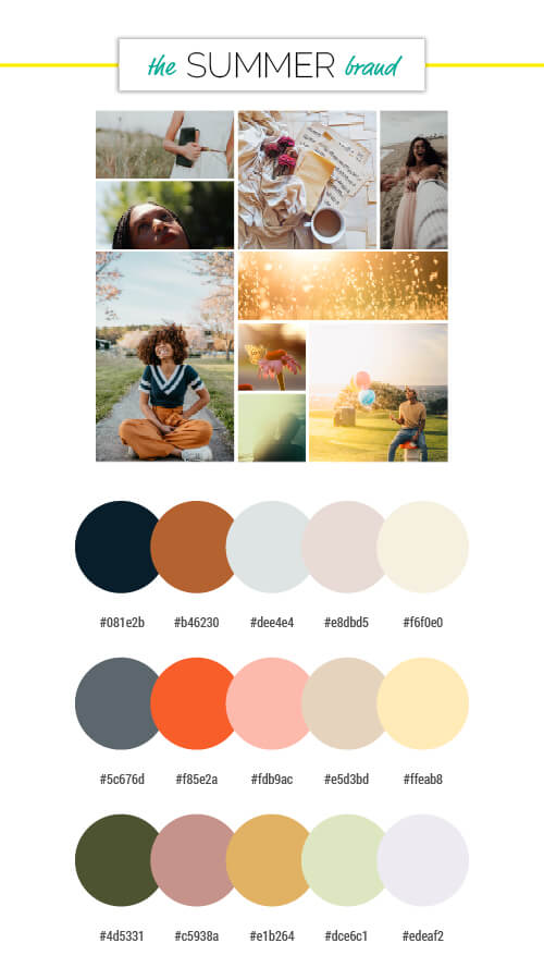
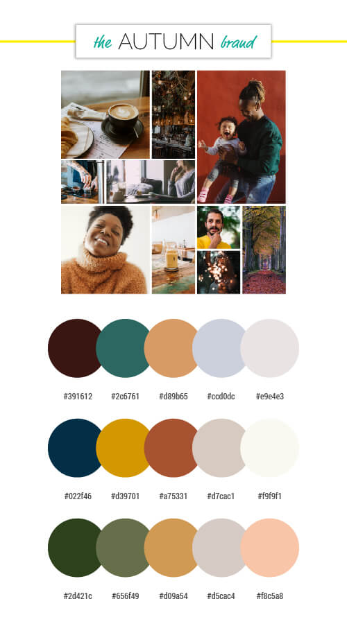
If we take the 4 mood boards from the brand personality post, you can see that each season’s mood board has a very different feel, and a very different colour palette. BUT there are lots of colour combination options within each board too. So how to pick what to use?
What does a good brand colour palette consist of?
Generally there should be between 4 to 6 different colours should be in your palette. Too few colours and it gets difficult to make anything stand out (like a website link or email address). Too many colours and things can get overwhelming and confusing – people won’t know where to look.
It’s about accessibility too. You need to make sure when you’re combining colours that they stand out. Yellow text on a white background is difficult to read. Red on green can be impossible to read for anyone with colour blindness. And, just as our hearing deteriorates with age, our eyes do too. If your target audience tends to be older having lots of high contrasting colours can make it hard for them to read your website and brand.
Don’t forget – not all colours we see with our eyes can be represented on screen. Eyes really are amazing things, we can see millions of colours, shades and tones. Computers are not so clever. Each screen will show colours differently, every mobile, laptop, tablet and desktop – all show colours slightly differently. If you’re using colours that are similar in tone don’t make them too similar, or use them on top of / next to each other. The subtleties will be lost, especially on screens!
You need colour variety – and that doesn’t just mean loads of different colours
What I mean is you need a mixture of dark, mid-tone and light colours – not just lots of different colours. Some colour palettes work brilliantly with only a couple of colours, BUT they need a variety of tones or shades to work well.
Single colour palette
This is RichCraft’s colour pallet.

Anyone that knows Tanya will know that purple is a colour that represents her well. But Why? If you look into the colour psychology of the colour purple (more about that in my blog here. Purple represents magic, power, creativity and luxury. RichCraft’s tag line ‘Coaching with a touch of magic’ means purple is the perfect colour to represent her and her brand. But it’s not just a single purple in her colour palette. When I was designing her branding I added a variety of purple shades. There is a very dark purple – almost black – that is used for the copy. For the background of the website I used a very pale grey-purple. There is a mid-tone but quite vibrant purple and a paler purply-blue to highlight certain website elements. And when you hover over a button or link on the site, another lighter purple can be seen.

You can see the full branding and website project here.
Multiple colour palette
In contrast to a single colour theme – colour palettes with multiple colours also work very well – but they still need dark, mid and light tones within them.
This is the colour pallet I created for Liam Gerrard, The Voiceover Chap. You can see the full brand and website project here.

His brand personality is autumnal and I used warm colours to represent this. His colour palette has dark gunmetal grey and orange, mid-tone green, teal and yellow, and 2 light greys.

Things to remember when picking your colours
When you’re choosing your colours and looking at your mood board, ask yourself these questions:
- Which colours are repeated in different images in your mood board? If your board full of shades of browns then include brown in your colour palette.
- Is your mood board bursting with lots of different colours or does a single colour dominate? The colour palette you pick should reflect this.
- Does your mood board have colours that harmonise or contrast? Summer and autumn mood boards will usually harmonise, winter and spring usually have contrasting colours.
- What are the different shades of colour on your mood board? Remember you need dark colours, mid-tones and light tones too.
- Do your colours work next to each other? Can you clearly see each colour when they are next to each other?
Colour palette samples
To give you some examples, I’ve picked out 3 colour palettes for each of the mood boards I created in my brand personality blog. The hex colour codes are on there too. If you think they suit your branding personality then feel free to use them on your own website. I’d love to see what you create, so if you do use them you can tag me on Instagram or Twitter.


To find out about Helen’s branding packages and start your own voiceover brand project CLICK HERE >>>